

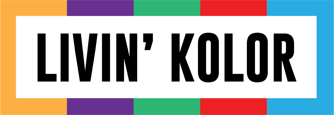
Livin’ Kolor
Logo + Visual Identity
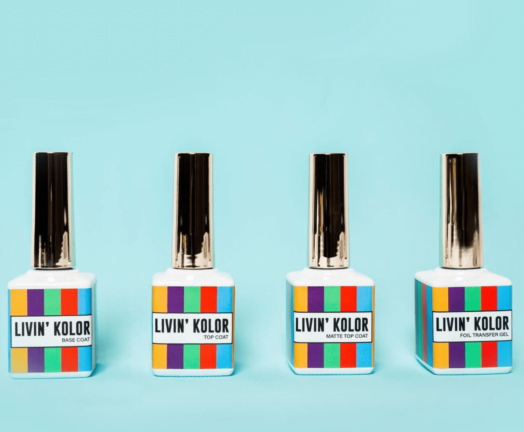
Package Design
About the Client
Founded in 2019 by Britanie Manning, Livin’ Kolor Cosmetics is a Canadian nail care brand that offers vibrant and non-toxic gel nail polishes for all skin tones. Inspired by 90’s hip hop, Livin' Kolor embodies the boldness, originality, and beauty of that era.
Best known for celebrating uniqueness and individuality, Livin’ Kolor aims to re-write the rules of beauty. Instead of focusing on mainstream trends, Livin’ Kolor listens to the community, the culture, and the people to decide what’s hot and what’s not.
About the Project
Livin’ Kolor needed a brand that uniquely expressed its creativity. With the goal to step out of the normal comfort zone of mute tones, we chose to be bold and bright with our designs!

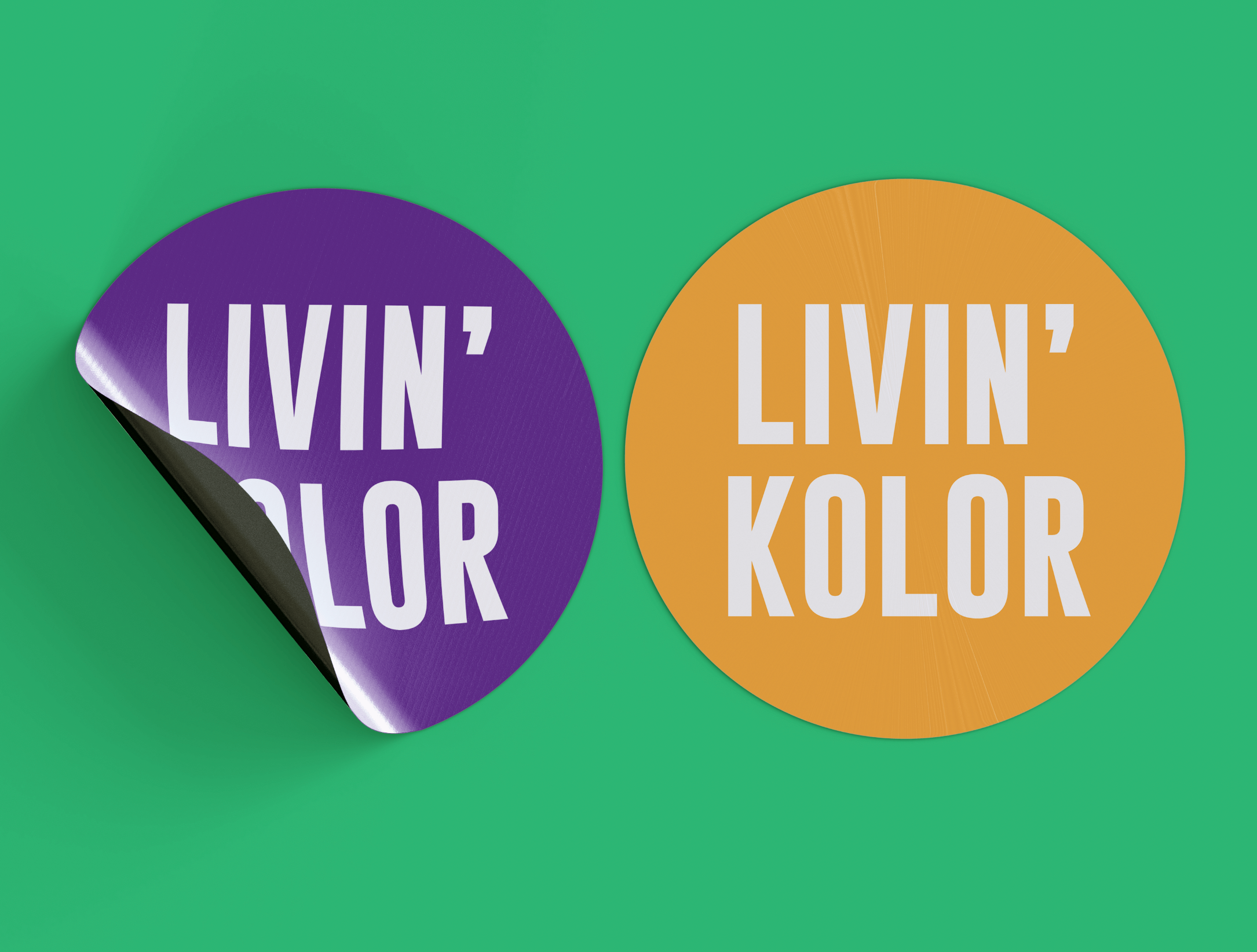

Logo Design
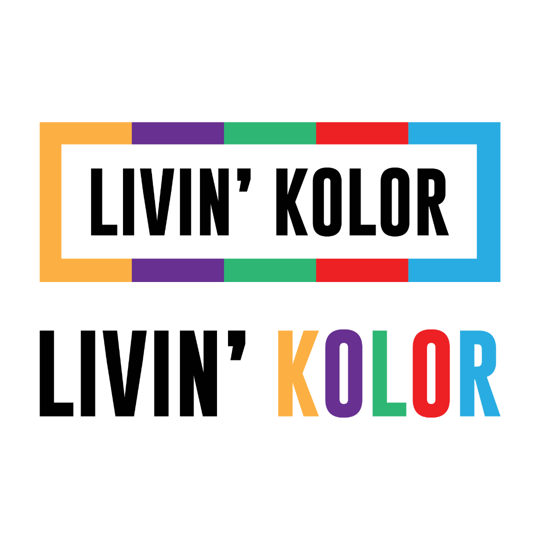
Livin’ Kolor logo was designed to be simple and expressive. The finished design variations had to work not only for digital platform, but also print material. The simple font and layout gives us that opportunity without having to sacrifice the bright colours.
Colour
This colour palette was uniquely designed to pair with Livin’ Kolor nail polish collection. This combination or primary and secondary colours are strategically placed to make it comfortable to view (it can be difficult working with bold colours without making the design feel overwhelming).
Colour Theory:
Bright Yellow - happiness, positivity, optimism
Light Blue - cleanliness, strength, dependability, coolness
-
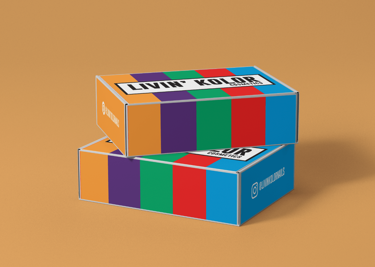
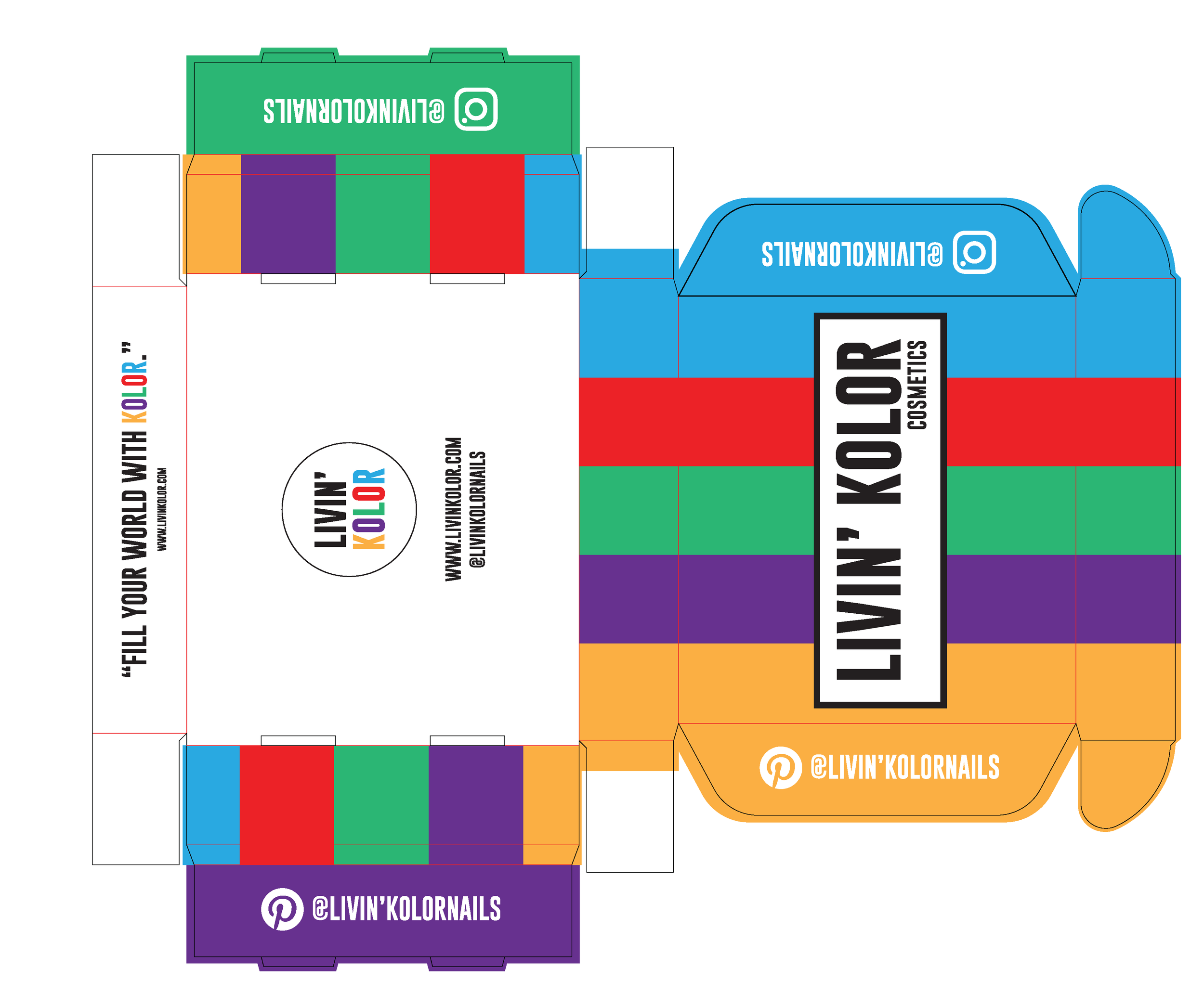
Box Design
The box was uniquely designed to mimic the branding on the gel bottle. We wanted to create something bold that creates excitement and in encourages buyers to share their experience with the product.
-
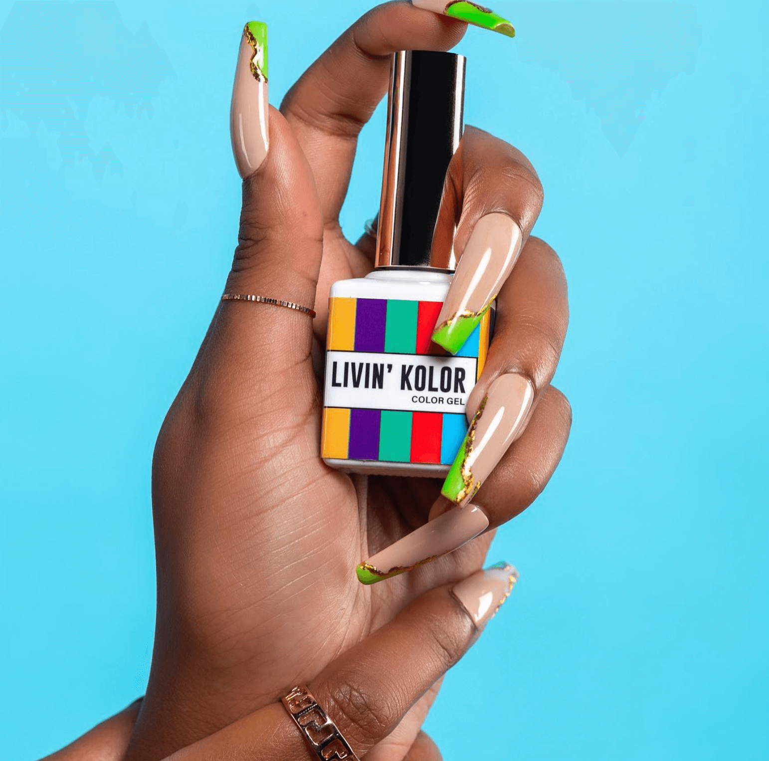
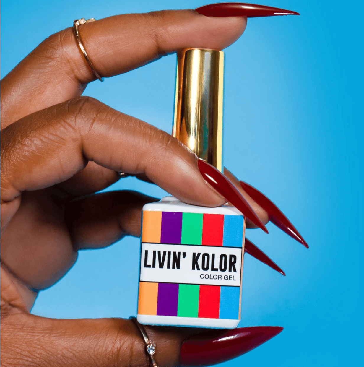
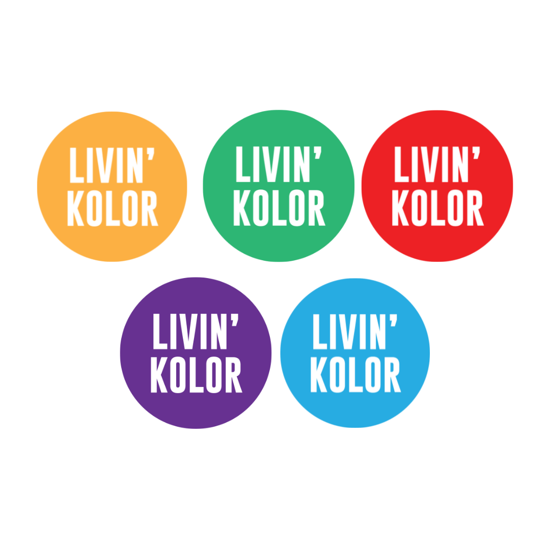
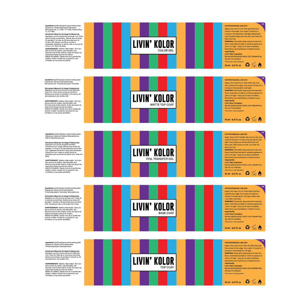
Gel Bottle Label
A custom label was designed for all 5 polish types. Thos label also had to include both English & French instructions/ingredients. A pull tab was designed to hide some ‘unwanted’ text but also make it easy for the consumer to access.
-
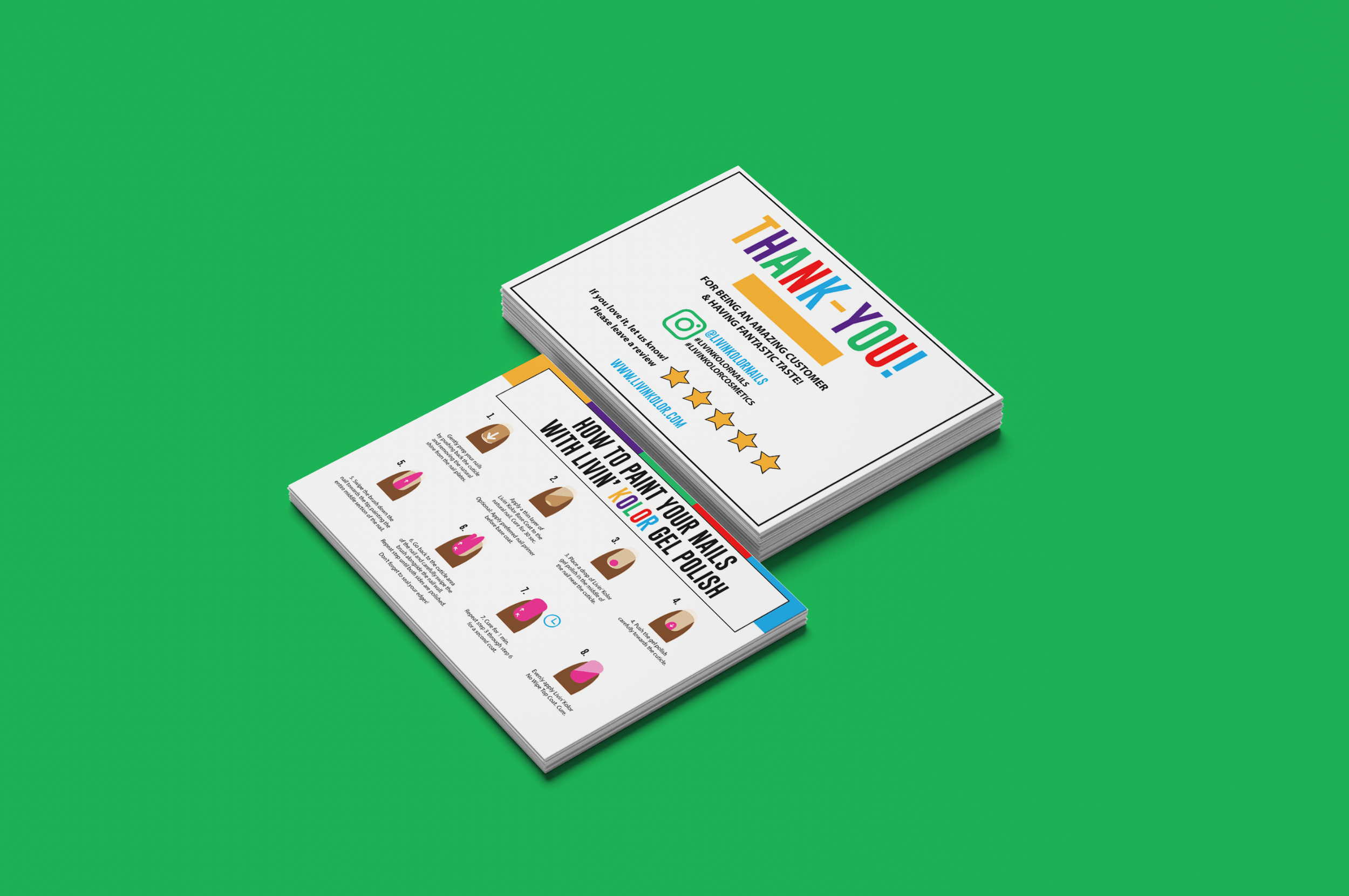
Instruction Cards
“How to paint your nails with Livin’ Kolor gel polish”
These post cards were designed to fit inside the box when. customer orders a set. We used custom nail images with arrows to show brush strokes.


← Emily Kay
